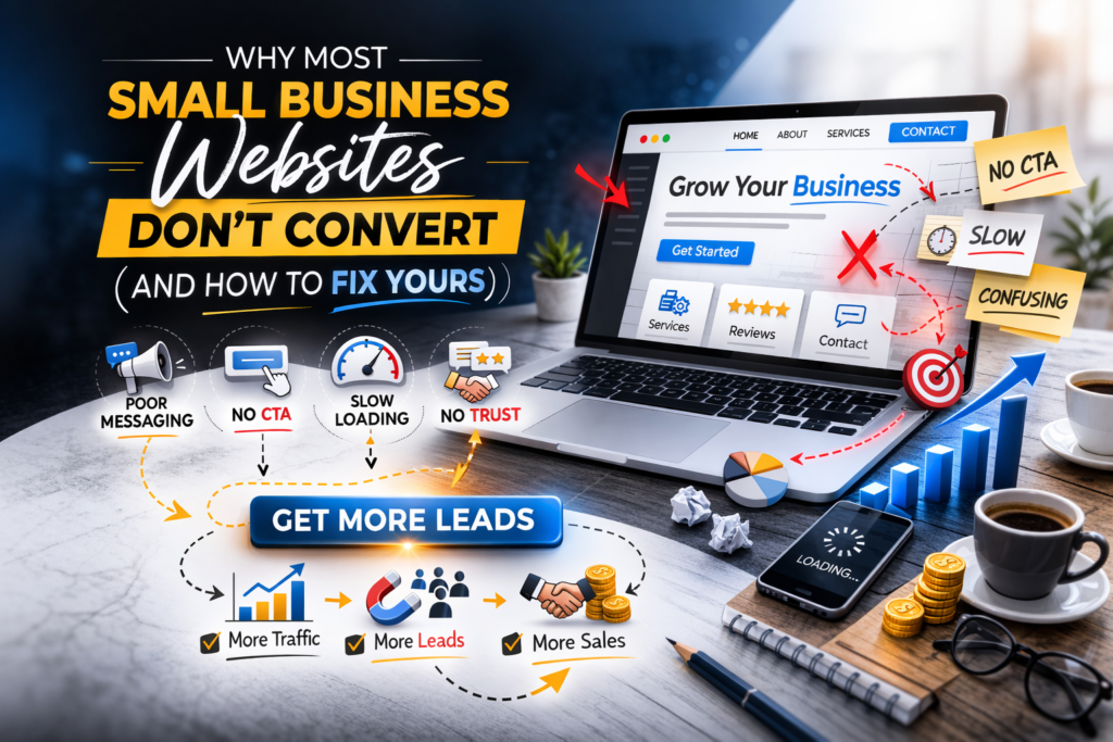
7 Reasons Your Small Business Website Isn't Generating Leads, And What to Do About It
You spent time and money getting your website up. Maybe you even threw some ad budget at it. Traffic trickles in. People browse around. Then they disappear no inquiry, no purchase, no follow-up.
The frustrating reality? Your website’s design probably isn’t the culprit. The real issue is that it was built to look good online, not to turn visitors into paying customers.
Here’s a breakdown of the seven most common reasons small business websites underperform, along with actionable fixes for each one. And for the digital marketers out there, this is one thing you should know before you start working on a website.

1. Your Website Talks About Yourself Instead of Solving a Problem
Walk through almost any small business homepage and you’ll find something like:
“We’ve been serving clients since 2015. Quality and integrity are at our core.”
It sounds professional, but it misses the point entirely.
The moment a potential customer lands on your site, they have one question running through their mind:
Can this business fix my problem?
If your content is focused on your history and values rather than their needs, you’ve already lost them.
The Fix
Reframe your homepage headline around three things:
- the audience you serve
- the challenge you address
- the outcome you deliver
Weak:
“Providing Digital Solutions for Modern Businesses”
Strong:
“We Help Local Trades and Service Businesses Win More Work Online — Without the Guesswork”
Clarity outperforms cleverness. Every time.
2. Visitors Can't Figure Out What You Do Within Seconds
Digital attention is scarce. Research consistently shows that people decide whether to stay on a webpage or leave within just a few seconds of arriving.
If your homepage doesn’t immediately communicate what you offer and who it’s for, visitors won’t dig deeper to find out. They’ll simply click away, often straight to a competitor.
The Fix
Try the five-second test.
Pull up your homepage, hand it to someone who hasn’t seen it, give them five seconds to look, then close it and ask:
What does this company do?
If their answer is vague or wrong, your messaging needs work.
Your above-the-fold section (the part visible before any scrolling) should contain three elements:
- a headline that names the benefit
- a brief supporting line for context
- a single action button

3. Your Calls to Action Are Too Generic to Motivate Anyone
“Submit.”
“Learn More.”
“Click Here.”
These phrases appear on thousands of websites. They’re so overused that visitors barely register them. More importantly, they don’t communicate any value, they just ask for action without giving a reason.
A call to action is essentially a micro-promise. It should tell the visitor what they’ll gain by clicking.
The Fix
Switch to outcome-focused button text.
Examples that work:
- “Claim Your Free Strategy Session”
- “Schedule a 15-Minute Discovery Call”
- “Get a Personalised Website Review”
Also be deliberate about CTA placement. Scatter them throughout the page, near the top, mid-way through longer sections, and towards the footer, so there’s always one within reach whenever a visitor is ready to move forward.
4. Slow Load Times Are Costing You Customers Before They Even See Your Content
Most people reaching your website today are doing so from their phone, often while on the move. If your pages are sluggish to load on a mobile connection, those visitors will abandon ship long before your content has a chance to make any impression.
If your pages take more than a couple of seconds to appear on a handset, many of those visitors will be gone before they’ve even had a chance to read your headline.
And consider your own behaviour, when did you last wait six or seven seconds for a slow website to load?
The Fix
Speed improvements don’t always require a developer. Start here:
- Compress large image files before uploading them
- Remove plugins or scripts that aren’t actively contributing to your site
- Move to a higher-quality hosting provider if yours is budget-tier
- Run your site through Google PageSpeed Insights for a free diagnosis
A faster site doesn’t just improve user experience, it also directly improves your rankings in search results.

5. Nothing on Your Site Gives Visitors a Reason to Trust You
Nobody hands over their money, or even their contact details, to a business they can’t verify. Trust is the invisible currency of online conversions.
A site that lacks social proof, real images, transparent contact information, or any evidence of past results feels anonymous. And when something feels uncertain online, people default to doing nothing.
The Fix
Build visible credibility into your pages:
- Genuine client testimonials, ideally with full names, photos, or company names
- Before-and-after examples or case studies showing real outcomes
- A clearly visible phone number, email address, or physical location
- An FAQ section that handles common objections upfront
Every trust signal you add removes a barrier between a visitor and a conversion.
6. Your Contact Forms Ask for Too Much, Too Soon
There’s an inverse relationship between form length and completion rates. The more fields you include, the fewer people will finish filling it out.
Asking for a full mailing address, annual revenue, detailed project specs, and a preferred callback window might feel thorough, but to your visitor, it feels like homework. Most people will abandon the form and move on.
The Fix
Trim your form down to the bare essentials needed to start a conversation.
Usually sufficient:
- Name
- Email address
- One relevant question
You can collect the finer details during the actual consultation or follow-up.
Also worth testing: a direct WhatsApp link.
Many people prefer the familiarity of messaging over filling out a form, and it can noticeably lift enquiry rates.
7. You're Not Measuring Anything - So You're Guessing
This might be the single most overlooked issue. A large number of small businesses have no idea how visitors are actually interacting with their website.
Without tracking in place, there’s no way to know:
- which pages are causing drop-offs
- which CTAs are being clicked
- whether any of your traffic is ever converting into leads
You end up making decisions based on gut feeling rather than evidence, and that gets expensive quickly.
The Fix
At a minimum, set up the following:
- A web analytics platform like Google Analytics to map out how people find and navigate your site
- Conversion tracking so you know when someone submits a form or calls you
- A basic heatmap tool to see where users click and how far they scroll
Data turns random website changes into informed decisions. Sometimes a single tweak, moving a button, rewriting a headline, can meaningfully shift your conversion rate. But you won’t know unless you’re tracking.
The Root Cause: You Built a Digital Brochure, Not a Lead-Generation Tool
Here’s the mindset shift that changes everything: your website isn’t a business card. It’s your hardest-working team member, available 24 hours a day, seven days a week, with no sick days.
A great salesperson:
- listens to the customer’s needs
- communicates clearly
- earns their confidence
- guides them toward the next step
Your website needs to do exactly the same thing.
Visual polish matters, but it’s strategic clarity and authentic trust-building that actually drive conversions.
Where to Start
If your website isn’t producing leads, you’re not alone, and you don’t necessarily need to rebuild everything from scratch.
Start by addressing the fundamentals:
- Rewrite your messaging to focus on customer outcomes
- Add specific, benefit-driven calls to action
- Improve loading speed, especially on mobile
- Introduce credibility signals throughout the page
- Simplify your contact form
- Install basic analytics and start tracking
The best way to evaluate your site is to approach it the way a first-time visitor would.
Ask yourself honestly:
If I had never heard of this business before, would I feel confident enough to reach out?
If the answer is anything less than yes, you’ve just identified your starting point.